Tech
Users of iPhones can move the Omnibox to the bottom in Google Chrome like Safari’s bottom nav bar

Android users using Google Chrome in the year 2020 wept in grief as the long-running Chrome Duet experiment came to an end. The address bar, also known as the Omnibox, may be moved from the top of the screen to the bottom by turning on the Duet feature flag. Before killing Duet, Google worked on it for four years, and Chrome users on Android still can’t move the Omnibox to the bottom. However, consumers now have a method to do precisely that thanks to Chrome on iPhone.
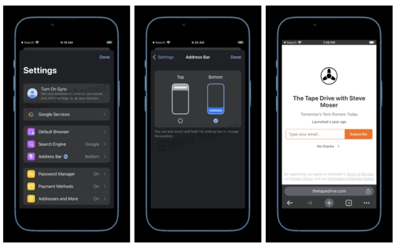
The address bar has always been located at the bottom of the screen in Safari, Apple’s default web browser. The Omnibox on Chrome for iPhone has always been at the top, which can be inconvenient for productivity. According to Steve Moser of The Tape Drive, iPhone Chrome users can now utilize a feature flag to move the Omnibox from the top to the bottom.
According to MacRumors contributor Steve Moser, a test version of Google Chrome for iOS now allows you to position the address bar at the bottom of the screen. It’s a good improvement that enables you to bring the address bar closer to your thumb; nevertheless, it should be noted that it comes two years after Apple made the URL bar the default location for Safari in iOS 15.
Two years after Apple’s Safari made the same change, Google is testing a feature in its Chrome browser for iOS that allows users to move the address bar to the bottom of the screen.
The URL bar and tab interface were relocated to the bottom of the iPhone by Apple in the iOS 15 beta testing period, a change that at first caused controversy among iPhone owners.
It was made simpler to navigate with one hand by placing the bar at the bottom of the interface, but not everyone was pleased. Apple included a setting to display the address bar at the top of the iPhone rather than the bottom for those who wanted the more iOS 14-like experience after hearing user input.
It’s unclear if Chrome will implement the adjustment for all users. Google attempted to implement a similar modification in Chrome for Android in 2017, but the feature was later taken away. But given that iPhone screens have generally become bigger over time, many people will probably embrace the shift if it takes hold.
-

 Gadget4 weeks ago
After Grand Success on BLDC Ceiling Fan, Eff4 Is Launching Smart Bulb
-

 Festivals & Events4 weeks ago
Google Celebrates Cherry Blossom Season with Animated Doodle
-

 Business3 weeks ago
Prakash and Kamal Hinduja: Driving Social and Environmental Change
-
Education3 weeks ago
Fred DuVal: University Leadership as a Critical Resource for Climate Change Research and Life-Saving Solutions
-

 Health3 weeks ago
The Hinduja Brothers Commitment to Global Health: Empowering Communities Across Borders
-

 Cryptocurrency3 weeks ago
Designed For The Masses: How Akasha (AK1111) Is Unlocking Crypto For The Next Billion Users
-

 Cryptocurrency3 weeks ago
Nexaglobal & Future World Token (FWT): Could This Be the Next Big Crypto Investment of 2025?
-

 Sports4 weeks ago
Women’s NCAA Tournament 2025 Sweet 16: Full Schedule, Fixtures, Teams, Bracket, and How to Watch March Madness Basketball Match Live


