
Tech
PayPal Updates its Brand Identity with a Bold New Look, Refreshed Font, and Logo
PayPal, a financial technology company, has updated its brand identity as the company enters a new era and moves in a new direction for the business.
PayPal has pioneered new and exciting international business practices for more than 25 years. As per Pentagram, the company behind the rebrand, the digital payment platform is now conducting a new era for customers by making it simpler for customers to shop and pay with PayPal from any location at any time.
As per the report, Pentagram partner Andrea Trabucco-Campos and his team developed a new identity as part of this evolution. This refreshed identity unifies the PayPal brand and conveys the company’s mission to revolutionize commerce on a global scale.
The system includes a motion language based on common payment actions like tapping, flipping, and swiping, a brand-new bespoke typeface, a simplified color palette, and PayPal Pro.
In the beginning, Pentagram and PayPal worked together to build a visual and strategic foundation for the brand identity that would help the company transform into a product or service that is more accessible to everyone.
These guiding principles have been developed to make PayPal more accessible to “Everyone, everywhere.” These principles include simplicity, optimism, and trust.
It was stated that the brand identity derives its strength from a visual language that is bold, open, and direct, as well as flexible enough to welcome brand partnerships and collaborations.
Additionally, the iconic PayPal monogram has been redrawn to be more sharp and modern. The angle of the layered letters in the updated mark stays the same, but the curves at the letterform’s corners have been de-rounded to make them appear sharper.
To give the layers of the logo a sense of depth and dimension that were not there before, the colors have been calibrated for continuous contrast. Venmo blue appears when bright blue and deep blue overlap, referring to PayPal’s expanding mobile app.
Despite the monogram’s connection to the accompanying logotype, it stated that the monogram’s layout remained unchanged. To improve the identity’s appearance and make it simpler to adapt to new circumstances, the symbol is no longer limited to the wordmark.
Through their simplicity, the two elements now function independently of one another, opening up more possibilities.
The foundation of the identity is the new PayPal wordmark, which is set in a new custom typeface called PayPal Pro that embodies the brand’s boldness, confidence, and clarity.
PayPal Pro is a customized version of Lineto Type Foundry’s LL Supreme, a contemporary take on Futura. Futura, originally designed by Paul Renner in 1927, is a geometric sans serif influenced by lettering proportions from almost 2,000 years ago.
The typeface keeps the attention on the message because of its timeless, universal shapes. Similarly, PayPal Pro aims to be entirely constructed of circular curves and straight lines. Pentagram is likewise working intimately with Lineto and PayPal to develop a secondary typeface, PayPal Pro Text, that is enhanced to perform at small sizes for legibility and utility, it said.
According to Pentagram, the new logo stands out from the blue that has come to be associated with fintech because of the timeless type and neutral black and white palette. Blues, on the other hand, serve as the brand’s energy and accent colors. The yellow from the previous palette, which was a duplication of other retail brands, is also removed by the system. The outdated yellow payment buttons have been replaced with black ones as part of this update to the user interface.
The simplified palette enables PayPal to dial up its brand personality in color-saturated imagery. The new photo direction demonstrates how simple it is to use the platform in authentic, real-life situations. and spontaneous.
The motion language of the identity draws inspiration from everyday digital and physical payment-related gestures and behaviors to emphasize PayPal’s ease of use. With taps, clicks, flips, and swipes, brand animations bring the movement of the product experience into the identity itself by activating the wordmark and typography.
On the rebrand, the Pentagram team worked closely with PayPal’s internal communications, marketing, and advertising teams as well as Diego Scotti, executive vice president and general manager of PayPal’s consumer group and global marketing and communications, and Geoff Seeley, PayPal’s chief marketing officer.
Pentagram and PayPal also coordinated the entire implementation of the new system, including a Will Ferrell-starring BBH Global advertising campaign.
According to the announcement, the expanded design system will include additional brand expressions that will be released alongside the new PayPal Debit Card.


House of Spells and Comic Con Liverpool Collaborate Again to Bring Wonder and Tourism to Merseyside
From Small Town to Startup Success: The Story of Frontlines Edutech Founders

Why Expert Opinion Matters for Strategy During Litigation
Vasid Qureshi, India’s Top Blogger Shares 5 Tips to Go Viral on Social Media

Bitcoin Mixer CoinJoin Unveils Innovative, Revolutionizing Cryptocurrency Transactions Top Best Bitcoin Mixer 2023

APPLY FOR A MONEY LOAN WITHOUT A CREDIT CHECK

House of Spells and Comic Con Liverpool Collaborate Again to Bring Wonder and Tourism to Merseyside
Liverpool, UK—House of Spells and Comic Con Liverpool are once again collaborating to bring the city alive with a celebration...
From Small Town to Startup Success: The Story of Frontlines Edutech Founders
Introduction In India’s booming EdTech space, there’s one name that’s making waves among Telugu students Frontlines Edutech. This is not...

Why Expert Opinion Matters for Strategy During Litigation
In litigation, often, the difference between winning and losing comes down to strategy. Although facts and conventional arguments are important,...
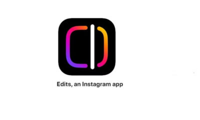

Instagram Launches ‘Edits’ App to Help Creators with End-to-End Video Editing – Everything You Need to Know
Instagram creators now have a new tool to try if they’re searching for a free editor to improve their videos....


6 Easy Steps to Optimize Your Google Business Profile for Local SEO to Boost Your Online Presence
A free tool to help you boost local SEO and attract more clients is your Google Business Profile. Your Google...
-

 Business3 weeks ago
Prakash and Kamal Hinduja: Driving Social and Environmental Change
-
Education4 weeks ago
Fred DuVal: University Leadership as a Critical Resource for Climate Change Research and Life-Saving Solutions
-

 Health3 weeks ago
The Hinduja Brothers Commitment to Global Health: Empowering Communities Across Borders
-

 Cryptocurrency3 weeks ago
Designed For The Masses: How Akasha (AK1111) Is Unlocking Crypto For The Next Billion Users
-
 Cryptocurrency4 weeks ago
Nexaglobal & Future World Token (FWT): Could This Be the Next Big Crypto Investment of 2025?
-

 Sports4 weeks ago
Women’s NCAA Tournament 2025 Sweet 16: Full Schedule, Fixtures, Teams, Bracket, and How to Watch March Madness Basketball Match Live
-

 Startup2 weeks ago
Cost-Saving Strategies Every Small Business Owner Should Know to Boost Efficiency
-

 Startup3 weeks ago
Matthew Denegre on the Art of Deal Sourcing: Finding the Right Investment Opportunities