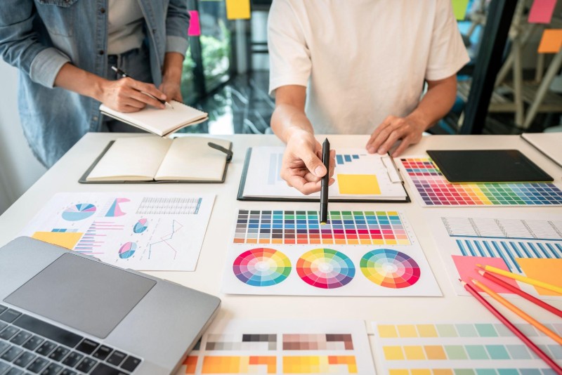
Color theory is a must-have for graphic designers. It helps them create visually pleasant and unified palettes. Understanding color theory principles lets designers effectively send messages and evoke feelings through their work. Colors are crucial for visual graphics. They grab attention and convey meaning. Different colors have different psychological effects on viewers. For example, red and orange induce excitement, while blue and green bring tranquility.
A harmony of colors is also essential. The combination of them looks good and makes a balanced composition. Designers can use complementary or analogous colors to achieve balance. In this exploration, Fawad Hekmaty provides an in-depth understanding of color theory tailored to the needs of graphic designers.
Colors are essential in our lives! Learn the color wheel and its categories: primary, secondary, & tertiary. It helps us to understand the relations between colors.
Primary ones are basic; you can’t create them with other colors. Red, blue, & yellow are examples. Secondary ones are made by mixing two primaries. For example, mix yellow & blue for green, red & blue for purple, and red & yellow for orange.
A tertiary is made by mixing a secondary and a neighboring primary. This gives us many colors. Also, complementary (directly opposite each other) creates contrast. Analogous (adjacent) form harmonious combos and balance. Knowing the wheels is beneficial when selecting a tone for painting, websites, etc. Use it to communicate emotions or messages.
They are critical for graphics. Designers can craft pleasing or contrasting arrangements that evoke emotions and communicate messages by selecting and combining hues.
Complementary colors are vital for creating contrast and making a visual impact. You can get dynamic compositions by combining those that are opposite each other on the wheel. Blue and orange or purple and yellow are great complementary selections for producing strong contrast – making certain elements stand out and creating a sense of interest.
Despite being contrasting, it has harmonious properties when used together. You can adjust the saturation to achieve balance. Also, play with the temperature of the hues for further visual interest and depth. When creating your palette, consider the context of your design project. Consider factors such as brand identity, target audience, and emotional response to create a harmonious one.
Monochromatic tones provide a subtle way of creating harmonious palettes. Different tints of one color can be used to achieve a unified look.
Picking the right hue for your project is about more than just looks. They can have strong psychological and emotional effects shaping the desired outcome. Here are three points to bear in mind when picking them:
Maximize the impact of color psychology in design with the strategic use of tones. Evoke desired emotions and create a substantial impact on viewers. Understand the psychological effects of them and their cultural connotations. Warm colors like red and orange generate feelings of excitement and energy. Cools like blue and green evoke a sense of calmness and tranquility.
The high contrast between them draws attention and makes certain elements stand out. Low contrast gives a subtle and harmonious look. Be aware of current trends and preferences. Different meanings across periods and industries. Stay updated on evolving trends to ensure designs remain relevant and engaging.
Online tools and palette generators are invaluable for designers and artists. These resources let them explore combos and create a palette effortlessly. Designers can experiment with colors to find the perfect scheme for their projects. Online tools visually represent colors, making it easier to understand complementary, analogous, and triadic schemes.
Palette generators take this further by suggesting them and creating complete palettes based on one hue. Just input one color, and these generators generate complementary tints that work together. Some online tools have an extra feature – you can adjust saturation levels or apply filters in real time. This lets you preview how your chosen one looks in different lighting conditions or when printed.
When using these tools, consider the context. Bright and vibrant ones might be great for web design but not professional documents or corporate branding. Pastel may be more suitable for art projects or interior.
Do you know that using websites and apps for exploring palettes emerged with digital design? Designers needed to streamline their workflow, so tools were created to help them. Nowadays, these tools are an essential part of the designing process.
For finding the perfect palettes for your project, here are five great resources:
Colors Theory is a must-have for graphic design projects. It helps create eye-catching, emotion-evoking designs. To use it effectively, the wheel and its relationships must be considered. Complementary tones, for instance, are opposite on the wheel and make a strong contrast when used together. Analogous colors near each other cause more harmony.
May is Small Business Month, a time to honor and recognize the achievements of the… Read More
Swiss International University (SIU) is on track to be one of the world's most respected… Read More
In a session that left students buzzing with fresh ideas and practical insights, Invertis University… Read More
At the 21st Shanghai International Automobile Industry Exhibition, which is surging with the wave of… Read More
Liverpool, UK—House of Spells and Comic Con Liverpool are once again collaborating to bring the… Read More
Introduction In India's booming EdTech space, there's one name that's making waves among Telugu students… Read More