“First impression remains”. When it comes to a professional website, a blog or even a page on social networks, this well-known jargon becomes the purest truth. No less than 94% of first impressions about a website are related to design. However complete and relevant the content may be, most people discard pages that are not visually appealing, intuitive or easy to navigate.
Structure and content
According to a survey conducted by Adobe in 2021, if respondents had only 15 minutes to access content, 66% said they gave priority to something that displayed a beautiful, well-crafted website that considered all aspects of designing for the web rather than plain and simple content. That same survey showed that 38% of people leave the site, if the content does not present an attractive layout or good quality images. This means that it is essential to balance the needs of your business with a touch of beauty, style and elegance, when setting up the structure of your website.
1. Opting for the best layout structure
Your first task will be selecting the layout for your new website. In a quick search, you can see that there are several structure options in: number of columns, position of the menu bar, footer size… basically, the entire layout of the page. There is no magic formula for presenting the perfect layout to your visitors. Each type of structure is more suitable for a different proposal.
2. Defining the colors of the website
What is your favorite color? That answer will certainly vary from person to person. Each individual responds differently to certain stimuli, whether verbal or visual. However, science has already proven that the human brain has a certain pattern of behavior when faced with the most different shades. It is called the psychology of colors. Psychology in marketing and advertising has been used for a long time to define buying trends or consumer behaviors. The use of a certain combination of colors, in general, can attract or repel customers or future buyers of your product or service. The colors for a professional website must be carefully thought out in order to provoke the right emotions, positively influencing the visitor’s decisions. It is true, there are no right or wrong rules or colors, those that bring a large number of conversions, clicks or sales.
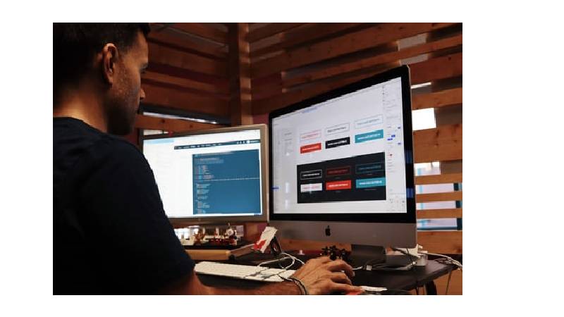
3. Choosing the sources
Like colors, the typography used on your website can create a positive or negative experience for your visitors. Found the following trends on sources:
4. Content design
In a nutshell, everything you look for on the internet is content.it is content that you are researching, consuming or sending. Your content needs to be optimized for search engines. The main pillars of these tools are the relevance and quality of the content. They use these and other attributes to rank and display the results to anyone who is looking for a particular information, product or service.
“A picture is worth a thousand words”. For centuries, this popular saying has summed up the power of visual communication. Although text has the ideal format to be recognized by search engines, no one can navigate for a long time on a website that contains only large blocks of written information, without photos, images or illustrations. The experience ends up getting monotonous for the user. ” Thus, images are a fundamental factor to enrich the user experience.
Liverpool, UK—House of Spells and Comic Con Liverpool are once again collaborating to bring the… Read More
Introduction In India's booming EdTech space, there's one name that's making waves among Telugu students… Read More
In litigation, often, the difference between winning and losing comes down to strategy. Although facts… Read More
Instagram creators now have a new tool to try if they're searching for a free… Read More
A free tool to help you boost local SEO and attract more clients is your… Read More
In today’s fast-paced digital world, online shopping has become more than just a convenience, it's… Read More